

A few weeks ago, I posted Looking for stock photos? Here’s how to take your own.
In this post, I listed Four Basic Elements of Stock photography and gave a brief description of each one.
Well in the next few weeks I’m gonna expand on each one. Then you, as a business owner can learn to take your own stock photos. Whilst it’s not easy initially, it is doable for almost anyone.
Even if you have no intention of taking your own, this is still a good guide to how good – nay great – stock images should be:
The first of these basic elements of stock is one that most will not even think about but is arguably the most important for a great image.
And that is – drumroll –
Background
In general, most backgrounds should be clear of any distractions and that means being ‘clean’ and simple.
Good backgrounds can vary in form but their prime importance is to highlight the main subject and purpose of an image.
A lot of backgrounds are bland, often either black or white. Some are blurred or out of focus.
But, if you look at this image below you can see that the background is full of distractions. That’s because the subject matter is not just the shop seller but the stuff and trinkets all over the shop.
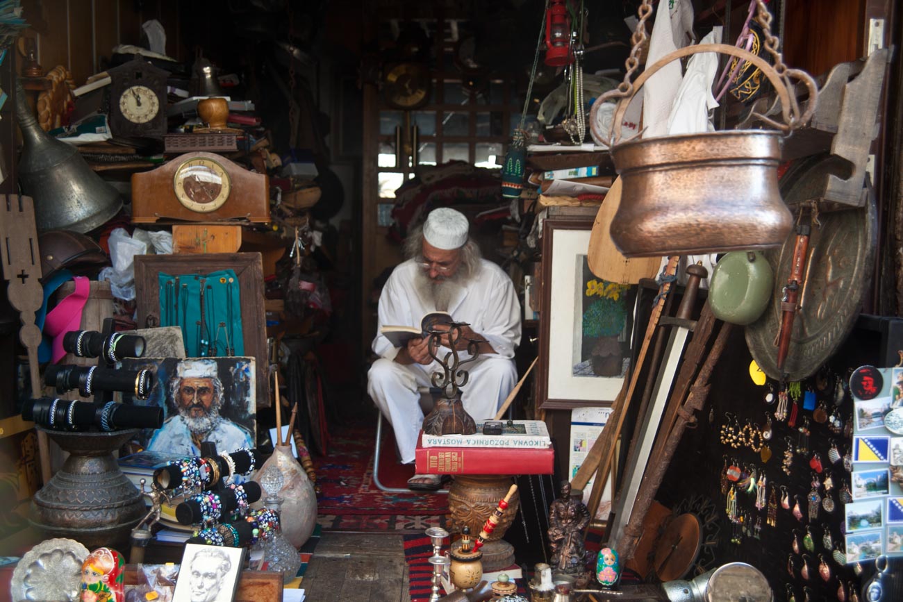
Taking the same scene with an out of focus background just wouldn’t be the same.
Genres
There are 100’s of genres of stock photos:
There’s Abstract, Aerial, Architectural, Conceptual, Conservation, Cloudscape, Documentary, Ethnographic, Fashion, Fine-art, Fire, Glamour, High-speed, Landscape, Nature, Photojournalism, Portrait, Selfie, Social documentary, Sports, Still life, Street, Underwater, Wedding and Wildlife to name but a few.
But rather than go through each one, we’ll pick out the most common types of background that a business owner will most likely need regardless of genres.
Let’s jot down some examples;
Staged backgrounds
Most product shots use a white or black background. There are lots of ways of creating either.
The simplest being the use of board like a matt board.
Of course if you are a master of photoshop you can take an image of your product on any background that contrasts with the product itself.
Then do a quick select and create layer to put onto another background.
Another way is to position the product on a piece of glass with a black background so that it appears to be floating.

Bokhe backgrounds
The out of focus (it’s called bokhe) look is best with people shots so that the whole image looks more authentic.
Why is that?
Well if you look at another person your eyes will focus on them and something most of us don’t notice, make the background slightly out of focus.
Slightly out of focus on an image doesn’t seem to have the same effect on the viewer as totally out of focus.
So, the photographer is trying get, to quote Wikepedia’s definition of Bokeh, “an aesthetic quality of the blur produced in the out-of-focus parts of an image produced by a lens”.
Not sure what all that means?
Look at this image and read 10 Vital Facts about Camera Aperture.

Other types of stock photos that use Bokhe are Abstract and Macro (e.g. flowers or small items like jewellry). A more left field genre that uses Bokhe is conceptual which is a type of photography that illustrates an idea.
Busy backgrounds
Most business photos usually have a slightly busy background to typify activity in the workplace and often include people as part of the scene.
If you are looking to show an activity e.g. making coffee in a cafe then you can get away with a fairly busy background. That can work well, so long as it doesn’t have distracting elements like bright colours or some other activities that take the eyes away from the main subject.
No background
In my years of learning photography, and I’m still learning by the way, the phrase of fill the frame was used in stock photography.
Filling the frame or zooming in, either by foot or by telescopic lens, to your subject matter is a great way of not having to worry too much about the background.
Stock agencies have tons of pictures that have filled that frame, with categories such as textures and abstract.
The benefits of these pictures is that sometimes you can also use them as a background which does mean a touch of post processing is required.
In the coming weeks I will create a basic background checklist which will help remind you of some of the items that we have just covered.
I cannot stress how important a good background is for a stunning image that will help you make more sales.
So as I said at the beginning, even if you are not going to take your own it’s vital you pay careful attention to the background of any image you are looking to use.
If you have any questions or comments about this post, please leave them in the comments section below.
Or feel free to contact me directly via my contact page
Sharing is caring as they say (although not sure who “they” are).
If there’s some people you know who may enjoy this or any other post on this site, please share with them.


Leave a comment